


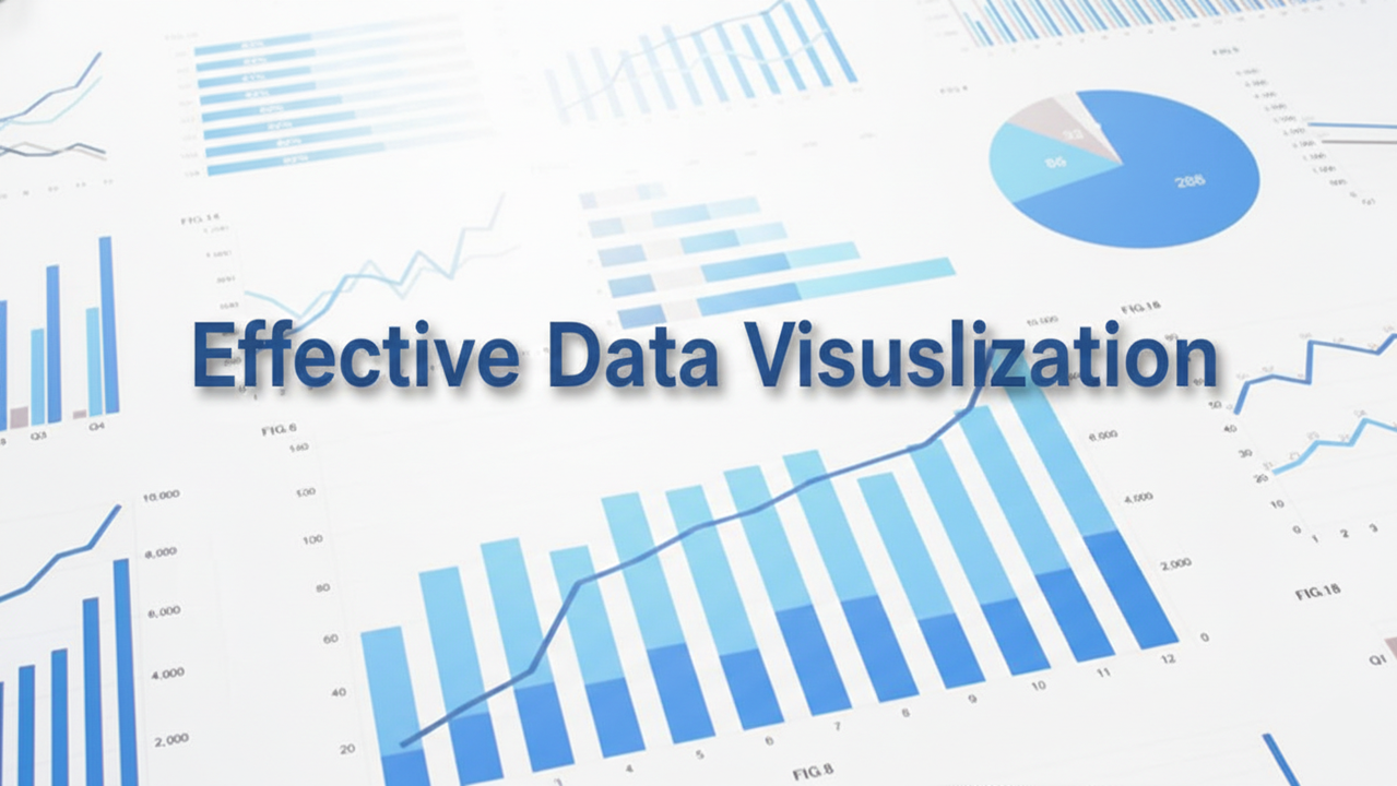
Beyond the Bar Chart: A Guide to Effective Data Visualization
We’ve all been there: staring at a slide deck full of cluttered “spaghetti” charts and neon-colored pie segments, wondering what on earth we’re supposed to be looking at.
In a world drowning in information, effective data visualization is your life raft. It isn’t about making “pretty” pictures; it’s about reducing the cognitive load on your audience so they can reach a conclusion faster.
Why Data Visualization Matters
The human brain processes visuals 60,000 times faster than text. If you want to persuade a stakeholder or explain a trend, a well-crafted visual does the heavy lifting for you. It transforms abstract numbers into a narrative.
1. The Golden Rules of Clarity
To master effective data visualization, you have to follow a few non-negotiable principles. Think of these as the “physics” of good design.
- Know Your Audience: Are you presenting to a CTO who wants technical depth, or a sales team that needs the “bottom line”? Tailor the complexity accordingly.
- The Data-Ink Ratio: Coined by Edward Tufte, this principle suggests that every pixel of ink should represent data. If it doesn’t serve a purpose (like unnecessary gridlines or 3D effects), delete it.
- Tell a Story: Every chart should answer a specific question. If your chart doesn’t have a point, it’s just digital wallpaper.
2. Choosing the Right Chart
The fastest way to ruin good data is to put it in the wrong chart. Here is a quick cheat sheet to help you decide:
| Goal | Best Chart Type | Why? |
| Comparison | Bar Chart | Great for comparing categories side-by-side. |
| Trends Over Time | Line Graph | Highlights the “flow” and direction of data. |
| Relationships | Scatter Plot | Shows if one variable affects another. |
| Part-to-Whole | Treemap | Better than pie charts for showing hierarchy. |
| Distribution | Histogram | Shows how often data points fall into certain ranges. |
3. Avoid These Common “Data Sins”
Even pros get tripped up by these common mistakes. Avoid them to keep your credibility intact:
The “Truncated Y-Axis”
Starting your Y-axis at something other than zero can make small differences look like massive leaps. It’s a classic way to mislead an audience (intentionally or not).
Color Overload
Colors should be used to highlight, not to decorate. If you use ten different colors, nothing stands out. Use a neutral palette (greys/blues) and one “pop” color to draw the eye to the most important data point.
Death by Pie Chart
Unless you are comparing two very distinct slices that add up to 100%, skip the pie. Humans are surprisingly bad at judging angles and area; we are much better at judging length (bars).
4. Tools of the Trade
You don’t need to be a graphic designer to excel at effective data visualization. Depending on your technical comfort level, here are the industry standards:
- Beginner: Google Sheets or Microsoft Excel (highly capable if you turn off the defaults).
- Intermediate: Tableau or Power BI (the “big hitters” for business intelligence).
- Advanced: Python (Matplotlib, Seaborn) or R (ggplot2) for total control and reproducibility.
Final Thoughts
Effective data visualization is a bridge between analysis and action. When you strip away the noise and focus on the “why” behind the numbers, you don’t just show data – you provide clarity.
Remember: If the user has to work to understand your chart, the chart isn’t working.