


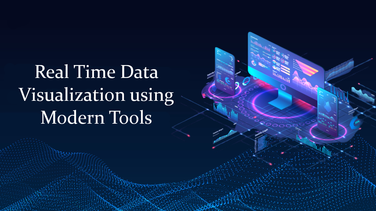
Real-Time Data Visualization Using Modern Tools
In 2026, the traditional “monthly report” has officially become a post-mortem. In a world driven by autonomous supply chains and AI-powered financial markets, waiting 24 hours for a data refresh is a liability.
Real-time data visualization is no longer a luxury for high-tech firms; it is the standard operating system for any business that needs to make decisions at the speed of thought.
1. The 2026 Visualization Powerhouses
The “Big Three” of Business Intelligence have evolved significantly to handle live streaming data without the need for manual refreshes.
- Microsoft Power BI: Now deeply integrated with Fabric, Power BI allows for “DirectLake” connectivity, giving you real-time visuals on top of massive datasets without moving the data.
- Tableau (Salesforce): Known for its aesthetic superiority, Tableau’s 2026 updates focus on Pulse, an AI-driven experience that pushes live “nuggets” of insight directly to a user’s mobile device.
- Google Looker: The go-to for cloud-native organizations. Looker’s strength lies in its semantic layer, ensuring that “Revenue” means the same thing across every live dashboard.
2. The Tech Stack Behind the “Live” Feed
Visualizing data in real-time requires more than just a pretty chart; it requires a high-performance backend. The 2026 “Streaming Stack” typically looks like this:
| Layer | Standard Technology | Role |
| Ingestion | Apache Kafka / AWS Kinesis | Captures events (clicks, sensor data, trades) as they happen. |
| Processing | Apache Flink / Spark Streaming | Aggregates and cleans the raw stream in flight. |
| Storage | ClickHouse / Pinot / Druid | OLAP databases optimized for sub-second queries on billions of rows. |
| Visualization | Grafana / Superset | Front-end tools that “poll” or receive “push” updates for the UI. |
3. Trends Shaping 2026 Dashboards
Modern visualization has moved past the cluttered “mission control” look. Here is what’s trending now:
AI-Augmented Narrative
Dashboards don’t just show a red line anymore; they explain it. Using Natural Language Generation (NLG), modern tools provide a text summary alongside the chart: “Revenue is down 4% this hour due to a checkout latency issue in the EU region.”
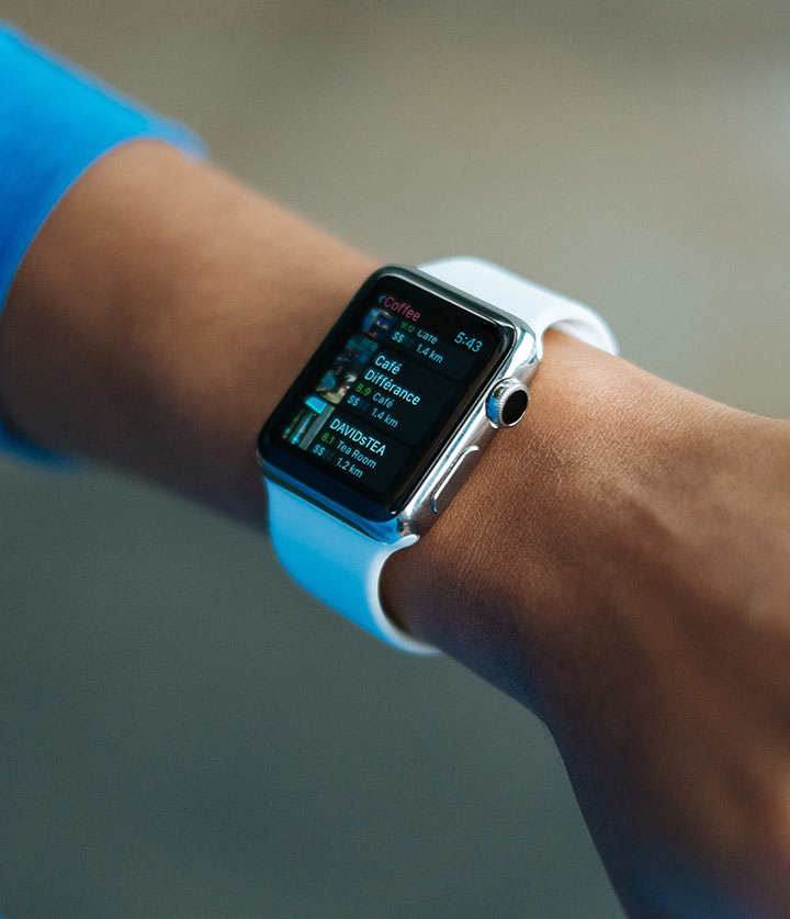
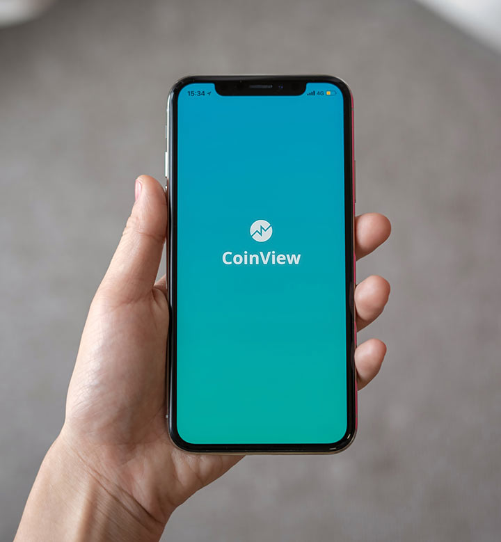
Mobile-First & “Glanceable” Design
With the workforce becoming increasingly mobile, 2026 dashboards are designed for the Apple Watch and mobile widgets. We use Data Minimalism—prioritizing one or two high-impact KPIs over a sea of bar charts.
Immersive Analytics (AR/VR)
For logistics and manufacturing, “Digital Twins” allow managers to step into a 3D virtual representation of their warehouse, seeing real-time stock levels overlaid on physical shelves using AR glasses.
4. Best Practices for High-Performance Visuals
To ensure your real-time dashboards stay fast and meaningful, follow these principles:
- Avoid “Dashboard Fatigue”: Just because you can update a chart every second doesn’t mean you should. Set your refresh rates to match the “actionability” of the data.
- Use High-Contrast Alerts: Real-time data is only useful if it grabs attention when something breaks. Use color-coded thresholds (Green/Yellow/Red) to signal anomalies instantly.
- Prioritize Latency over Granularity: In a live view, a 95% accurate trend that is 1 second old is often better than a 100% accurate count that is 10 minutes old.
- Ensure Mobile Responsiveness: Use “Responsive Breakpoints” so your complex grid layout on desktop transforms into a vertical stack on a smartphone.
5. Common Pitfalls to Avoid
- The “Flashing” Effect: Constantly shifting charts can be distracting. Use “Smooth Interpolation” so lines transition gracefully as new data points arrive.
- Ignoring Data Quality: Streaming data is often “noisy.” Always implement a “Confidence Interval” or a “Quality Score” on your live dashboards so users know if the data stream is currently reliable.
Final Thoughts
Real-time data visualization is about turning data into a reflex. By combining modern tools like Power BI with a robust streaming backend, you enable your organization to stop reacting to the past and start shaping the present.